
Reimagined interface unleashes the power of simplicity and usability!
Witness a remarkable transformation as I unveil the revamped UI/UX of WinAutomation into Power Automate Desktop, elevating user-friendliness and visual appeal to unprecedented heights. Bid farewell to the outdated design and embrace a sleek, modern interface that effortlessly captivates and simplifies people’s experience.
Role
Senior designer (full-time)
Employer
Softomotive, acquired by Microsoft, Athens (hybrid)
Teammates


Year
2019 2020 2021
Tools
Adobe Suite, Sketch, Figma & Axure RP
Skills
Summary
- Principal designer for Power Automate Desktop (Windows 11)
- Collaborated with stakeholders to define clear design goals
- Redesigned UI and improved UX through iterative design and usability testing
- Addressed dated design, user-unfriendly UI and accessibility issues
- Prioritized accessibility with high-contrast and screen reader enhancements
- Enhanced iconography and overall design system
- Result: successful project launch with impressive reviews
Overview
One of the products I'm most proud of designing is a desktop app initially called WinAutomation from Softomotive.
I was the principal designer on the project, responsible for everything from user research to iterated UI/UX design in a truly agile (meaning that we abided by all the rituals) team of seven.
I conducted internal user testing and feedback sessions throughout the design process to ensure the app met the needs of our target audience. On the process, the app was acquired by Microsoft and is now included in Windows 11 with its new name, Power Automate Desktop or PAD for short.
PAD is a low-code desktop automation solution that allows users to free up time and focus on things that really matter. Its key highlights:
1
Automates repetitive tasks
2
Enhances productivity
3
Integrates multiple systems
Problems
Prior to its transformation into PAD, the product was known as WinAutomation and was under the ownership of Softomotive.
Upon joining the team, I encountered three primary challenges with the product:
1
It was dated
A visually outdated and disconnected design was observed by everyone
2
It was hard to use
A shift towards simplified user journeys for a wider user base was needed
3
It was inaccessible
Inclusive design is paramount for users with various limitations
Opportunity
"How can we streamline and simplify automation support for a broad audience?"
User persona
To gain a deeper understanding of our users, I crafted a persona to empathize and connect with their needs on a personal level.
Execute without oversight
"I'm tired of spending hours on end doing the same monotonous tasks."
Boost productivity
"The repetitive nature of these tasks leave me feeling unproductive."
User persona
Methodical at work
"I'm motivated to find a way to free up my time and focus on more important work."
Automate workflows
"I yearn for a solution that brings ease and efficiency into my daily workflow."
Failing to meet OKRs
"The lack of automation options makes me waste time and my potential."
Design goals
The design process for WinAutomation commenced with thorough internal research. I initiated discussions with key stakeholders, including designers, developers, managers, the CTO and the CEO who had started it all.
My primary focus was on customer care representatives who had valuable first-hand insights. Additionally, I collaborated closely with tech writers who had been writing help page articles based on customer requests.
After gathering all the necessary pieces, the head of design, product manager and I collaborated to meticulously subcategorize the tasks into four main categories that I worked on as a the principal designer.
UI design4
UX improvements3
Accessibility3
Design system4
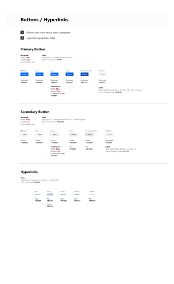
UI redesign
When I undertook the UI facelift of the app (in 2019), it was still sporting a skeuomorphic design style reminiscent of the mid-2000s.
We embarked on a transformational journey by introducing:
- Colors
- Flat style icons
- Enhancing layouts
- Incorporating helpful illustrations
Click on the switch below ![]()
Curious about details? Dive a little deeper
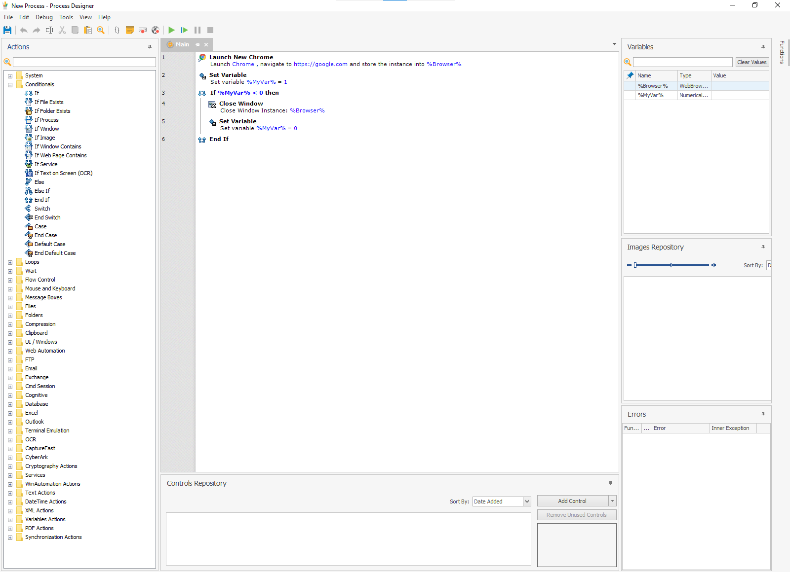
![]() WinAutomation (before)
WinAutomation (before)
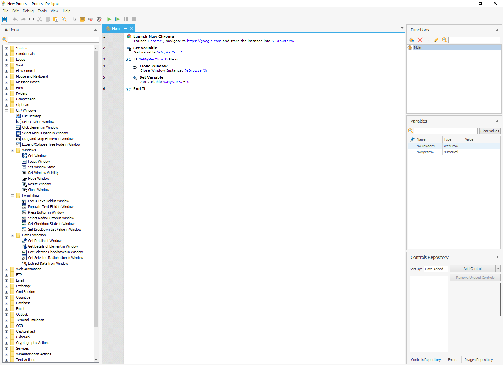
![]() Power Automate Desktop (after)
Power Automate Desktop (after)


UX improvements
During the project, I communicated with stakeholders, involved developers early, maintained consistency with existing patterns, made enhancements, prioritized accessibility and conducted design QA checks for usability
User research
I conducted user research to gain insights
Defined objectives
I clearly defined the objectives of the UX & UI improvements based on feedback and business priorities
Information architecture
I assessed the app's UX flows and identified opportunities to simplify them
Wireframing & prototyping
I created wireframes and interactive mockups to validate design ideas, with feedback from stakeholders
Iterative design
Incorporating feedback I iterated on the mockups and prototypes
Usability testing
I conducted usability testing sessions to identify further areas for refinement
Accessibility
Why it matters
Every human on the planet approaches situations differently.
We all have different ways to think about problems, different things we need to make decisions and different ways we like to learn.
— Cambridge Cognition


Inclusive design principles
My work was based on three principles:
- Recognize exclusion
- Learn from diversity
- Solve for one, extend to many
Throughout the development process, I meticulously oversaw the implementation, ensuring that screen readers and high contrast modes worked without any disruptions.
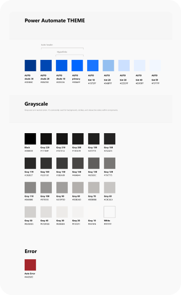
Design system
When I joined WinAutomation, there was no established design system in place.
One of my responsibilities was to initiate the process by carefully analyzing the existing patterns and compiling an inventory of design assets and components across the entire Softomotive product family.
Just as I began the componentization process, the company underwent acquisition by Microsoft.
Consequently, I shifted gears and transitioned to utilizing Microsoft's renowned Fluent design system, aligning our efforts with their established framework.
Project launch results
Starting with a closed circle of beta testers, we verified that we had successfully achieved all the project goals.
From there on, since its acquisition by Microsoft, the app's user reach grew exponentially. As part of the Power Automate family (which allows other parts of Microsoft Office and more automation) it offers a lot more than originally anticipated.
Since it's included in Windows 11, it's attracting millions of users worldwide who rely on it to save time and prioritize their core tasks.
The business impact was huge and can be seen by the peer reviews it has received.
4.5 out of 5
 376 reviews
4.5 out of 5
137 ratings8.3 out of 10
 200 ratings
4.4 out of 5
162 reviews4.0 out of 5
51 reviewsConclusions
Effective collaboration: The project's success hinged on seamless collaboration among individuals from diverse teams and locations.
Clear communication: Open and effective communication channels were essential to ensure everyone was aligned and felt productive in a cohesive working environment.
Adaptability to change: The acquisition of the company introduced new systems and processes, requiring the team to adapt and embrace change, leveraging it as an opportunity for growth.
Humility and teamwork: A low-ego approach and a strong focus on teamwork allowed accepting feedback and a collective commitment to achieving the project's objectives.
Continuous improvement: Regular retrospective rituals provided valuable insights for refining workflows, identifying areas for improvement and implementing adjustments to enhance future projects.
NEXT STEPS
The journey of Power Automate Desktop is an ongoing one, marked by continuous growth and endless possibilities.
By harnessing the power of Chat GPT's technology across our product lineup, we have revolutionized the ease of building natural language-based automations.
Thank you for reading! ![]()
![]() Yet another daily standup
Yet another daily standup
![]()
![]()
![]() At the new office
At the new office
![]()
![]()
![]() Microsoft at night
Microsoft at night
![]()
![]()
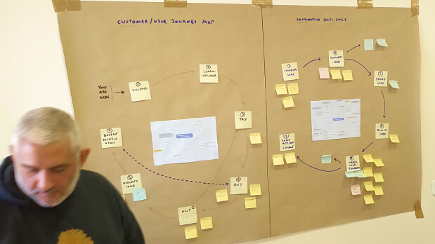
![]() User journeys
User journeys
![]()
![]()
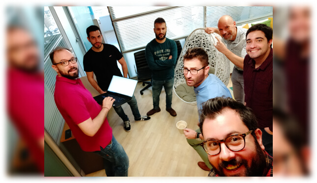
![]() George & Jesus
George & Jesus
![]()
![]()
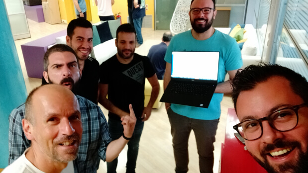
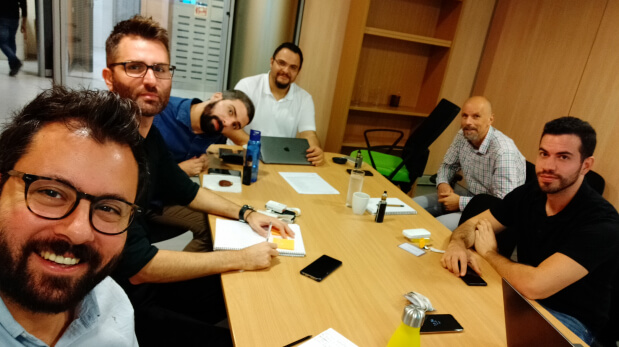
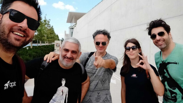
![]() Apollo team on a typical standup
Apollo team on a typical standup
![]()
![]()
![]() Apollo team in retrospective mode
Apollo team in retrospective mode
![]()
![]()
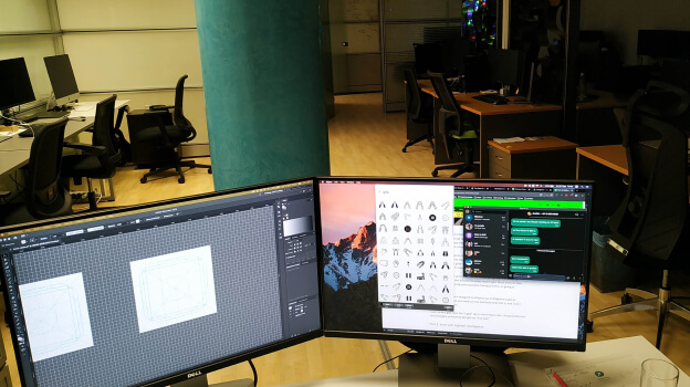
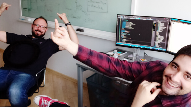
![]() Working on the icons
Working on the icons
![]()
![]()
![]() Design + QA
Design + QA

![]()
![]()
![]() Good ol' fun around the Xmas tree
Good ol' fun around the Xmas tree

![]()
![]()
![]() Design team out and about
Design team out and about
![]()
![]()
Press
Microsoft acquires Softomotive to expand low-code robotic process automation
"During his Build keynote, Microsoft CEO Satya Nadella today confirmed that the company has acquired Softomotive, a software robotic automation platform." —TechCrunch
Read article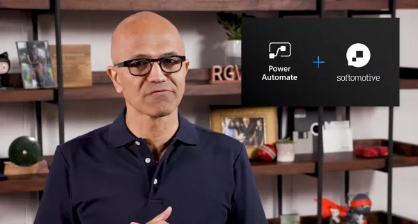
Real world automation stories with Microsoft Power Automate
This post contains a set of automation stories curated by the Power CAT team with a focus on robotics process automation (RPA) in Power Automate. —Microsoft
Read article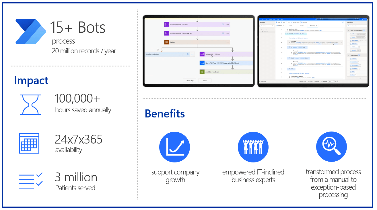
On this page
Next project
Senior UX designer (full-time) 2021 2022
With OgmaCast you can make online calls better with Spotify and voice tweaks.
Check this out to find out how I led this greenfield project and designed a new product from scratch!
Credits
This page was made possible by using many technologies which are either open source, or free to use. The least I could do, is to give credits to all the contributors for making our world open. THANK YOU.