Make online calls better with Spotify and voice tweaks.
Quickly and easily. Scroll to find out more!
Role
Senior UX designer (full-time)
Employer
accusonus, acquired by Meta Reality Labs, Athens (remote)
Year
2021 2022
Tools
Figma, HTML/CSS & JS
Skills
Summary
- OgmaCast is a simple tool to fine tune your voice and add ambient music during online calls
- I was the principal designer working on this "greenfield" project
- Conducted research to identify use cases
- Designed user journeys, wireframes, mockups and a prototype
- Iterated further based on user feedback
- Production blocked due to company's acquisition
Overview
OgmaCast is your go-to solution for enhancing voice quality during calls and infusing them with Spotify or local background music, all with remarkable ease.
While initially crafted to cater to the needs of gamers, streamers, and podcasters, our vision pivoted to instead cater for business professionals seeking a seamless audio experience.
Whether in a virtual meeting or leading a yoga class, OgmaCast empowers you to own your voice and set the perfect audio backdrop, creating unforgettable online interactions.
Main features
Μusic with Spotify
Noise remover
Overall better voice call
Voice deepener
Voice EQ
Voice leveler
Problems
Mostly based on assumptions through research, the team decided to focus on three key problems that professionals were facing during online calls.
1
Inability to add music to online calls
2
Babies crying, dogs barking in the background
3
Flaky sounding voice can lead to miscommunication
Opportunity
"How can we improve the quality of online calls? How can we allow instructors to add music using Spotify and local files?"
Competitive analysis
During the research, we found that all meeting apps lacked a background noise suppression mode, creating a unique opportunity for our product. The same for adding music using Spotify and local files.
Our analysis examined key players in the online communication meeting space, uncovering strengths and weaknesses. These insights guided our product's differentiation and the right market fit.
Competitors
Krisp
Voicemod
Meeting apps
Teams
Meet
Discord
Slack
Zoom
Skype
Music apps
Spotify
Tidal
Discovery phase
During the discovery phase, I analyzed UI's and UX's from key competitors as I typically do.

A sound shield during calls
Krisp.ai
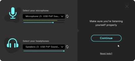
Voicemod - Little did I know I'd be working with them next
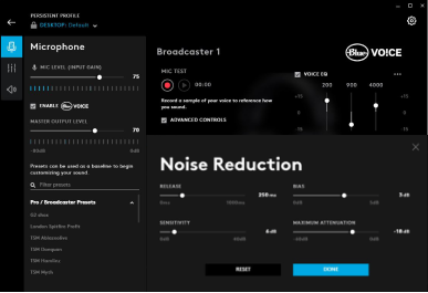
Logitech's Blue Vo!ce
Moreover, I tried to understand and define what we wanted to build. The process I follow from finding to execution can be split into two big clusters, where each of them represents a substantial part of building the right thing.
Those two cover the product discovery itself and the product development based on the previous findings. There's also a learning stage, where findings, takeaways and insights are shared with the team in order to improve the next interactions.
My go-to design framework
User persona
Our user personas typically were casual users engaged in online calls through platforms like Google Meet, Zoom, Teams, Discord or Skype.
During my research I stumbled upon additional personas such as content creators in the streaming and podcasting world to those hosting live web radio shows. We decided to cater to their needs as well.
All of them share a common desire for enhanced voice quality and the ability to add music in the background whether it's for entertainment or business purposes.
1
Increased clarity
I want top-notch audio, intuitively managed, no pricey gear
2
Higher confidence perception
I want my voice to convey authority and accountability
3
Richer content with background music
I want to easily add music from Spotify or my local files
User persona
User journey
Idea? Check! Assumptions? Check. User validation? Semi-check! Let's get crackin' then and we'll see how it goes!
Which path is the easiest? Which solution creates least friction? What do the findings from competitors say? Do they work? Can we improve them? It was a period of shaping.
Splash screen onboarding process
Start by selecting a microphone
Record a small clip of my voice
Auto-tune with optimal settings
Play voice with the ability to bypass & compare
Show tabs/dials for options:
Noise Remover
Voice EQ
Voice leveler
Voice deepener
Add music using Spotify or local files
Wireframes
Although I started presenting the product as it eventually came to be, its initial version had additionally a voice changer and small library of sound effects.
The team was considering launching this app with its main target audience gamers however we pivoted from that.
Below are some of the wireframes that helped shape the product.
Initial mockups (Mid-Fi)
What the framework above showed was basically the double diamond model. Depending on the requirements and the time restrictions, I leverage it to guide my product design process by emphasizing divergent and convergent thinking in two distinct phases.
In the first diamond, I explore and broaden possibilities during the discovery phase, using wireframing to converge on a clear direction. The second diamond involves defining the chosen path and refining details.
The Double Diamond Model - adapted from the UK design council
In my experience thus far, the divergence and convergence occur during the initial phase namely during wireframing, while the final version takes shape during mockup design. That was until this project came along.
This time around the convergence happened during the mockup design. Why? Well because that was when I had a moment of realization. Check out below the mockups based on the wireframes.
Initial variations
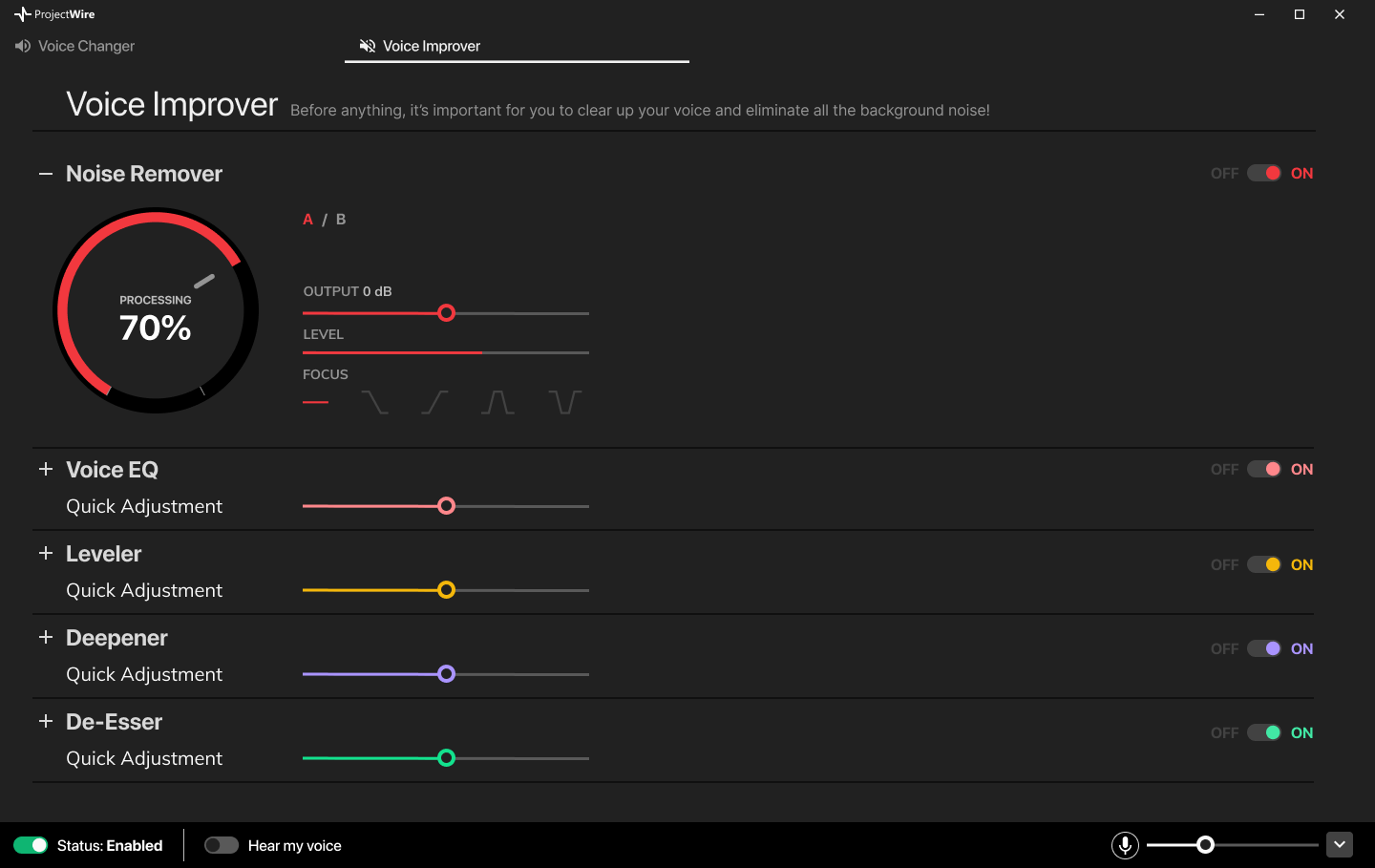
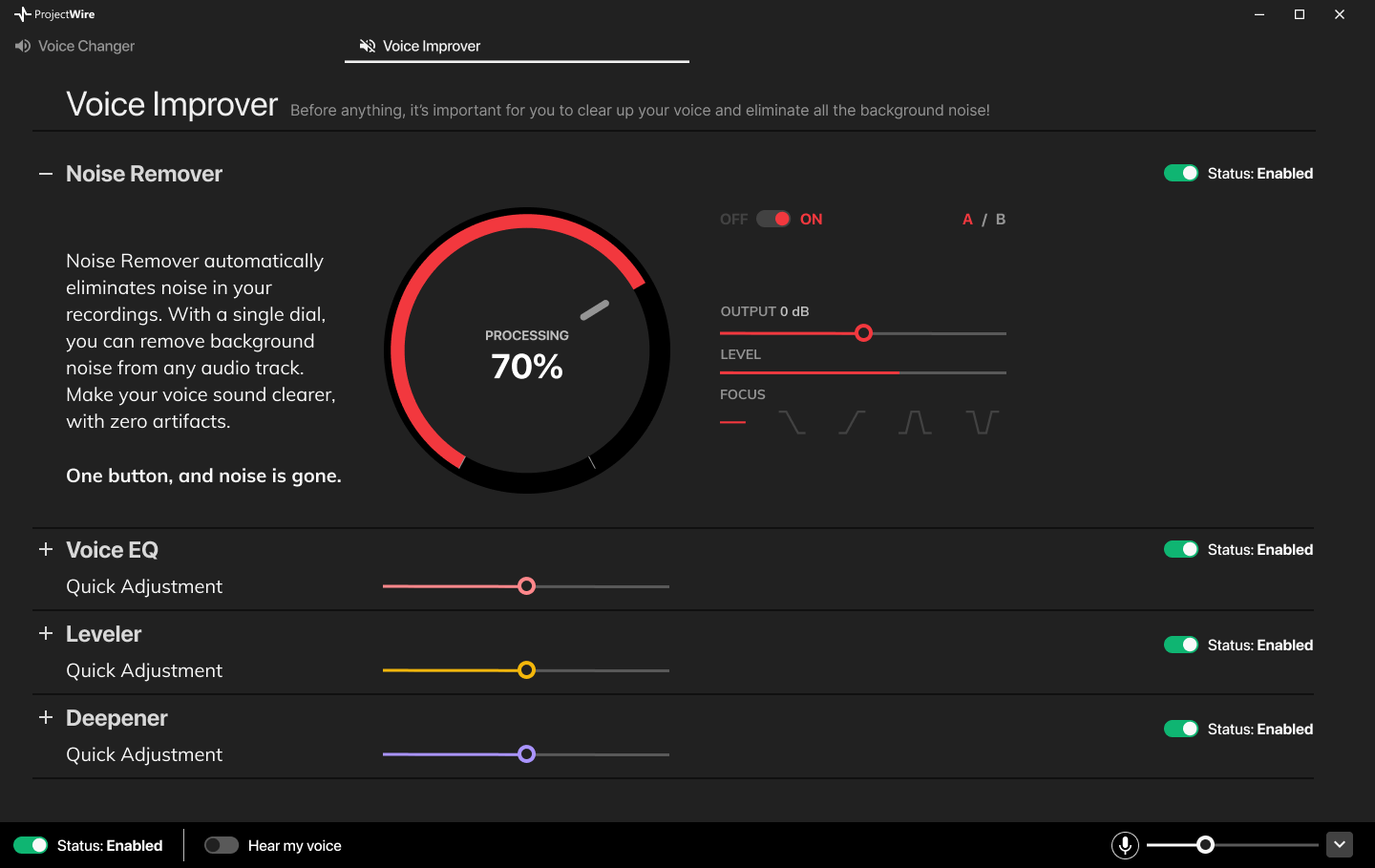
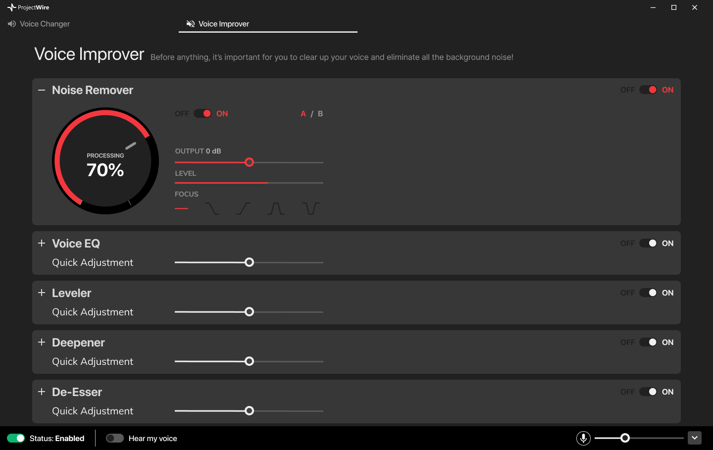
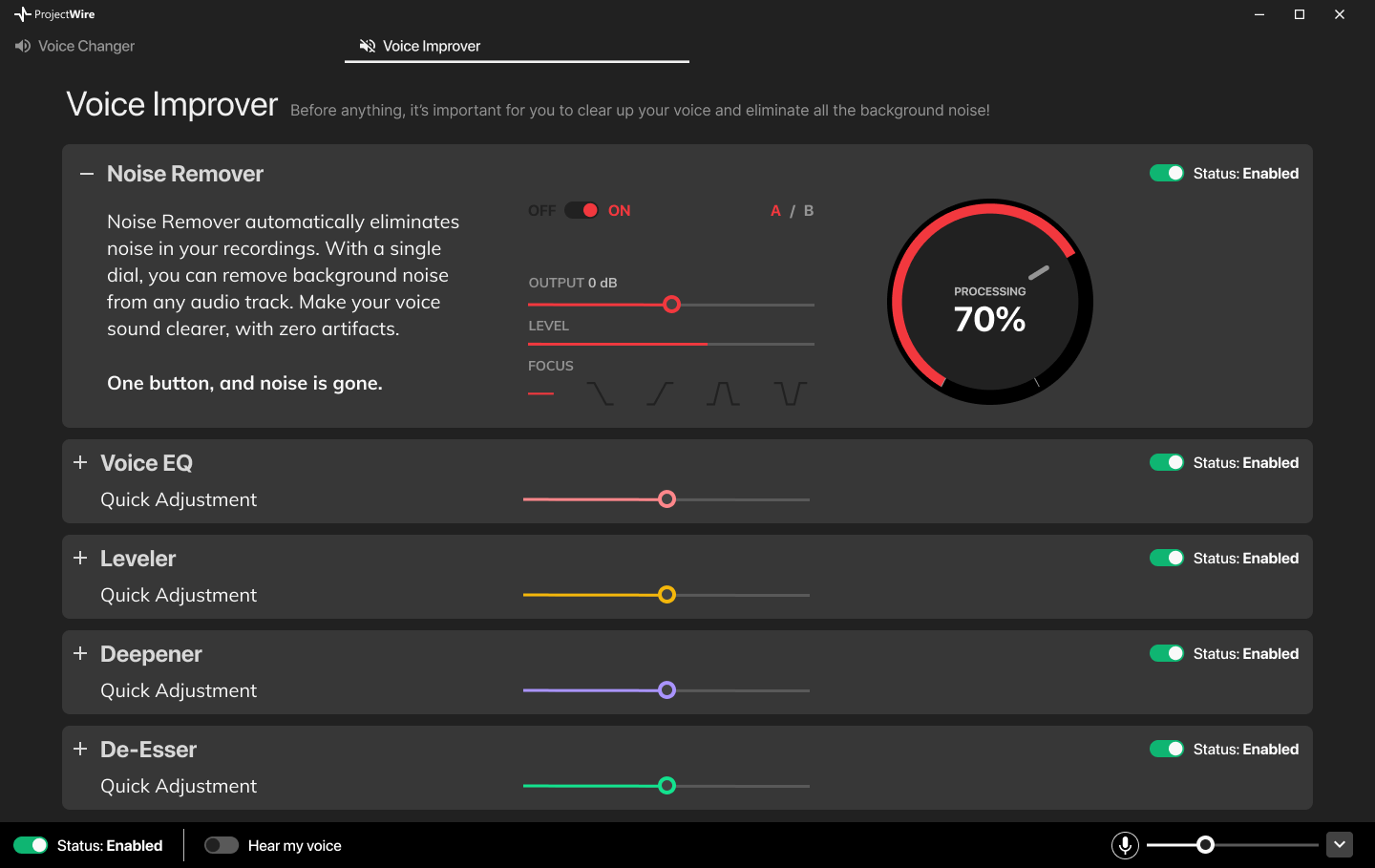
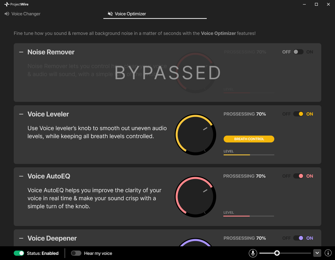
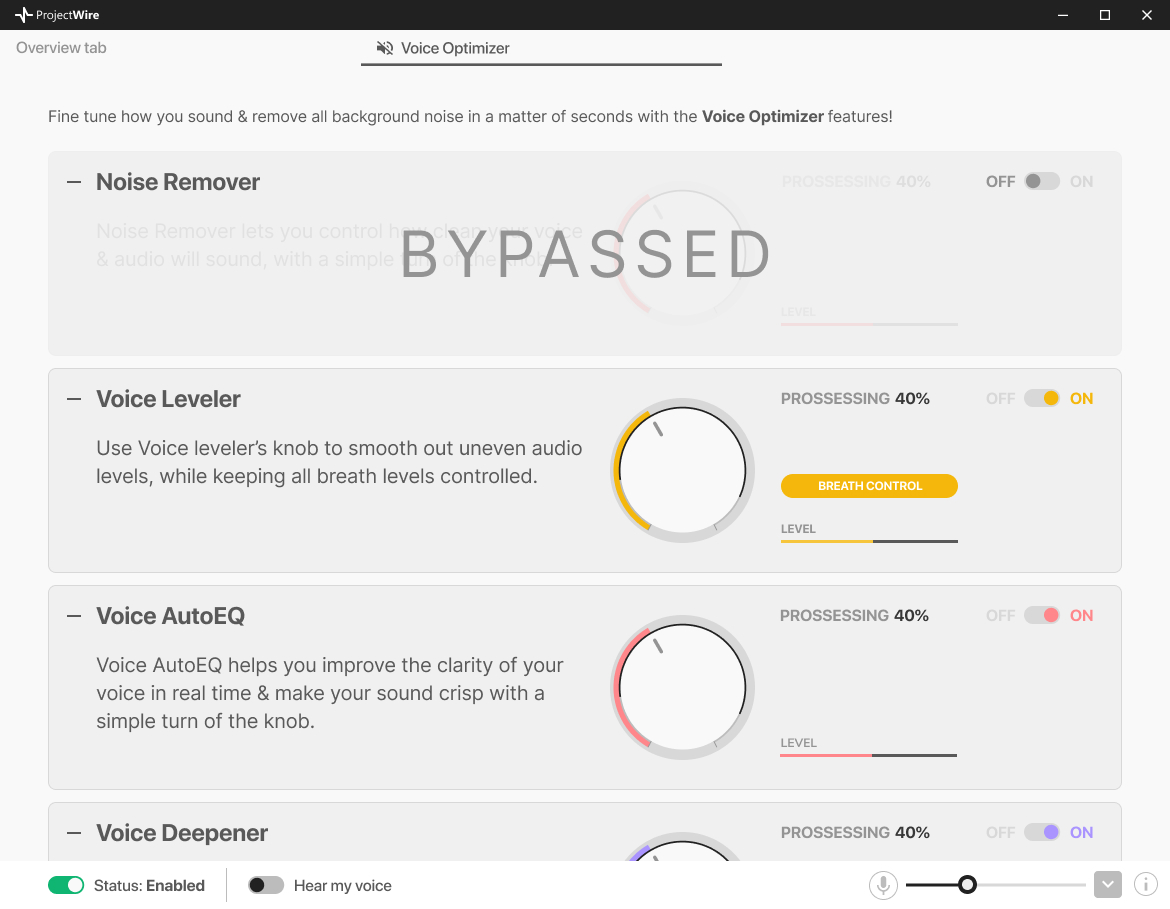
The aesthetics were heavily influenced by the design system of our family of products.
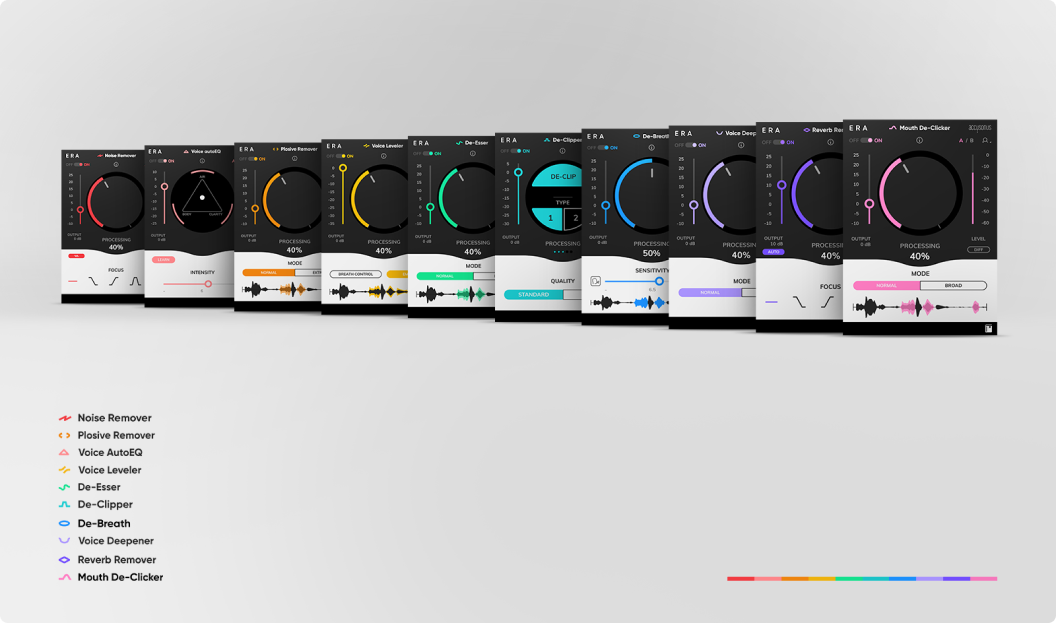
The ERA Bundle
Voice Leveler
Reverb Remover
Voice autoEQ
The company's main offering were the audio plugins above. By taking advantage of our technology we wanted to create this a new product called "OgmaCast".
The size of the window and the design architecture assumed that the user would use this app on its own.
Audio Clean-Up Assistant was a plugin that combined other plugins
All of these plugins were available for use within video and audio editors. We were looking to expand our offerings and escape the limited container of plugins.
We figured, why not create a standalone app that would leverage the tech behind the ERA family? Why not channel that expertise into another segment?
Prototype
Since our company was 90% remote, we were all potential users of this app. For starters it was decided by the stakeholders to test our assumptions within the company and so, I conducted user testing sessions with my colleagues.
More specifically:
- I enlisted colleagues from departments other than design and development
- I arranged the meetings
- I made them feel at ease
- I asked them to try out the Figma prototype while sharing their screens, hearts and minds
- I asked them open ended questions
- I rephrased and re-asked important questions
- I took notes and shared them with the product manager for us to decide what we deemed important
Iteration based on user feedback
One of the things that really hit the spot when it comes to user research, is the way ideas and implementation is challenged. When designing things within a closed circle of people, no matter how experienced its members are, there's always the possibility of something escaping from the team's perception.
This time around, was the size of the window and its architecture. Why was it so big? Why did we think that the users would want it to be in landscape orientation? I was the one to blame really; I hadn't visualized it properly in context but thankfully, after the user interviews, it occurred to me.
I redesigned the app in a way more simplified way and presented it to the team of stakeholders and explained why it was important. They all bought in.
User testing ensures that the end product aligns seamlessly with user needs and expectations. "You've got to start with the customer experience and work backward to the technology." —Steve Jobs
Final mockups (Mid-Fi)
Following the feedback I received and our overall work on the project, I changed the look and feel quite a bit. We needed the window to be smaller so it could be side by side with any given meeting app for the user to customize their voice and depending the persona, the background music too.
OgmaCast main screens for voice optmization, background music & settings
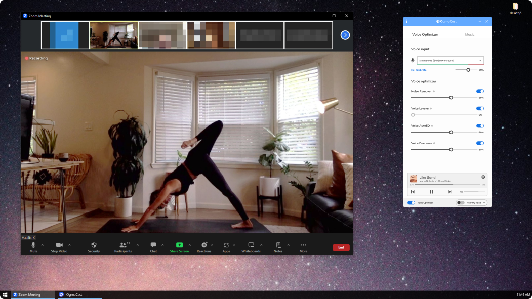
OgmaCast during a yoga class
OgmaCast (aka ProjectWire) dark theme, fun exploration
Prototype
Figma prototypes no doubt rule.
The way anyone can quickly create one and add all sorts of animations, effects, sticky sections and all that is stunning.
Building a prototype with HTML may be somewhat harder and more time-consuming to create, but in the end of the day, they're better in conveying a true sense of the final product. They're a lot better in helping the team see even clearer possible pitfalls and shortcomings of the design.
That's why I really like working on HTML prototypes using Bootstrap. I love validating the UX and the UI of the app in depth.
Here's the HTML prototype of OgmaCast, check it out!
A clickable HTML prototype
Sudden death
Before having a chance to really polish the UI and make the app production ready, the company was acquired by Meta and blocked further development of this app.
Would it have turned into a solid competitor to Krisp.ai? I think so! It's a shame we didn't get to find out. Either way the next steps would have been to:
- Polish the UI to reflect brand's identity but awesomeness too in dark and light theme
- Add new components and update the design system accordingly
- Conduct usability tests to ensure ease of use
- Learn, improve and take the experience to the next level by identifying new features
Thank you for reading! ![]()
On this page
Next project
Senior staff product designer (full-time) 2022 2023
Voicemod is a B2C MacOS and Windows real-time voice changing app.
Discover how I successfully reduced the app's uninstall rate by revamping the onboarding experience and conducting user testing with individuals who encountered difficulties during setup.
Credits
This page was made possible by using many technologies which are either open source, or free to use. The least I could do, is to give credits to all the contributors for making our world open. THANK YOU.


